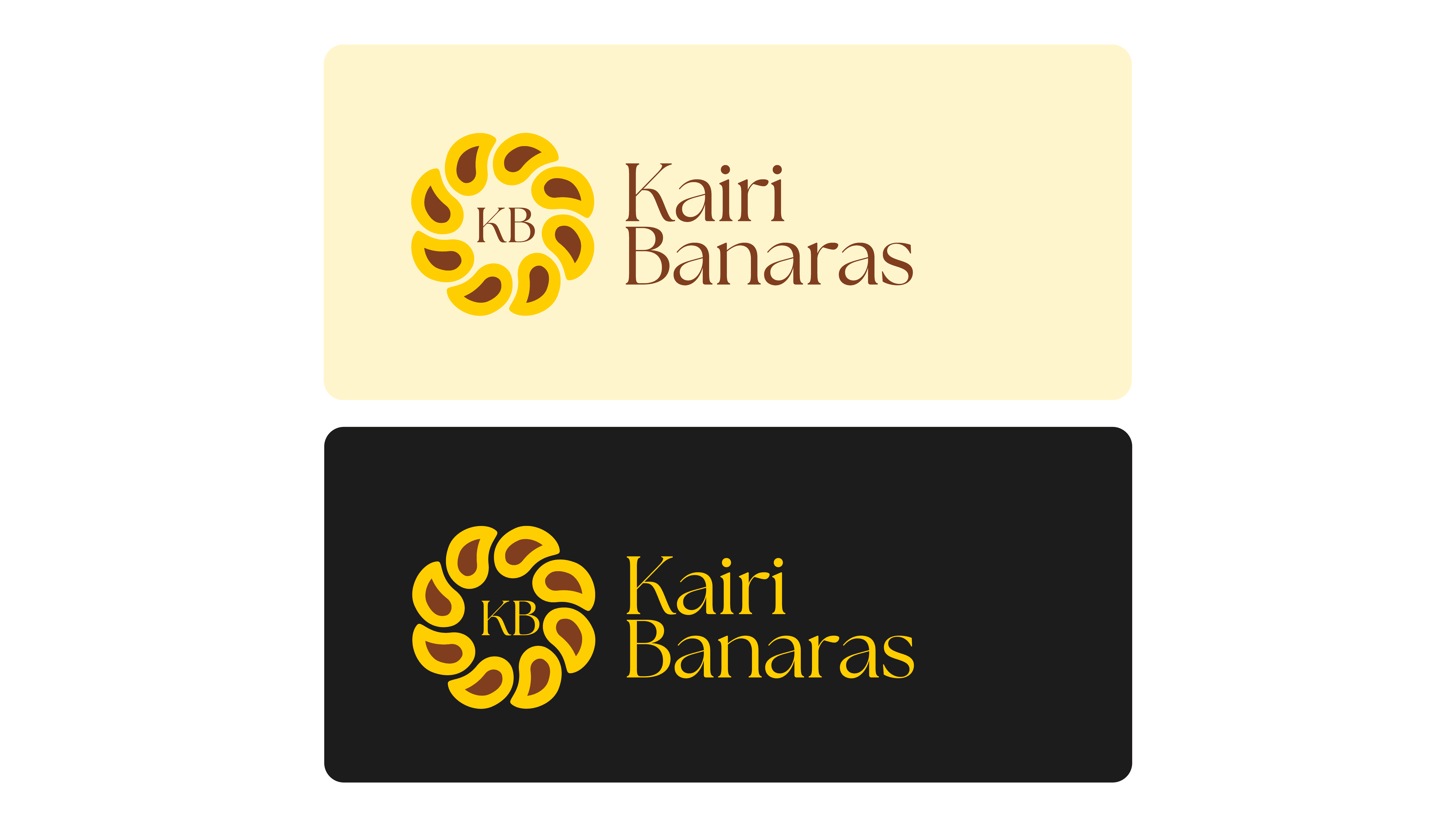
Kairi Banaras
intro.
I developed the brand identity for Kairi Banaras, a heritage Banarasi silk saree label entering the retail market after 75 years of craftsmanship. The visual language blends cultural depth with modern simplicity. Every element, from logo to colour to typography, was crafted to reflect timeless elegance while appealing to a new generation of buyers.

challenge.
The brand had no previous identity or visual system, despite decades of legacy in manufacturing. It needed a look that would instantly feel premium and culturally rooted but not old-fashioned. The key challenge was to strike a balance between tradition and modernity. The identity had to work across print, digital, and textile labels, and still stay distinct in a saturated market of ethnic wear brands.
result.
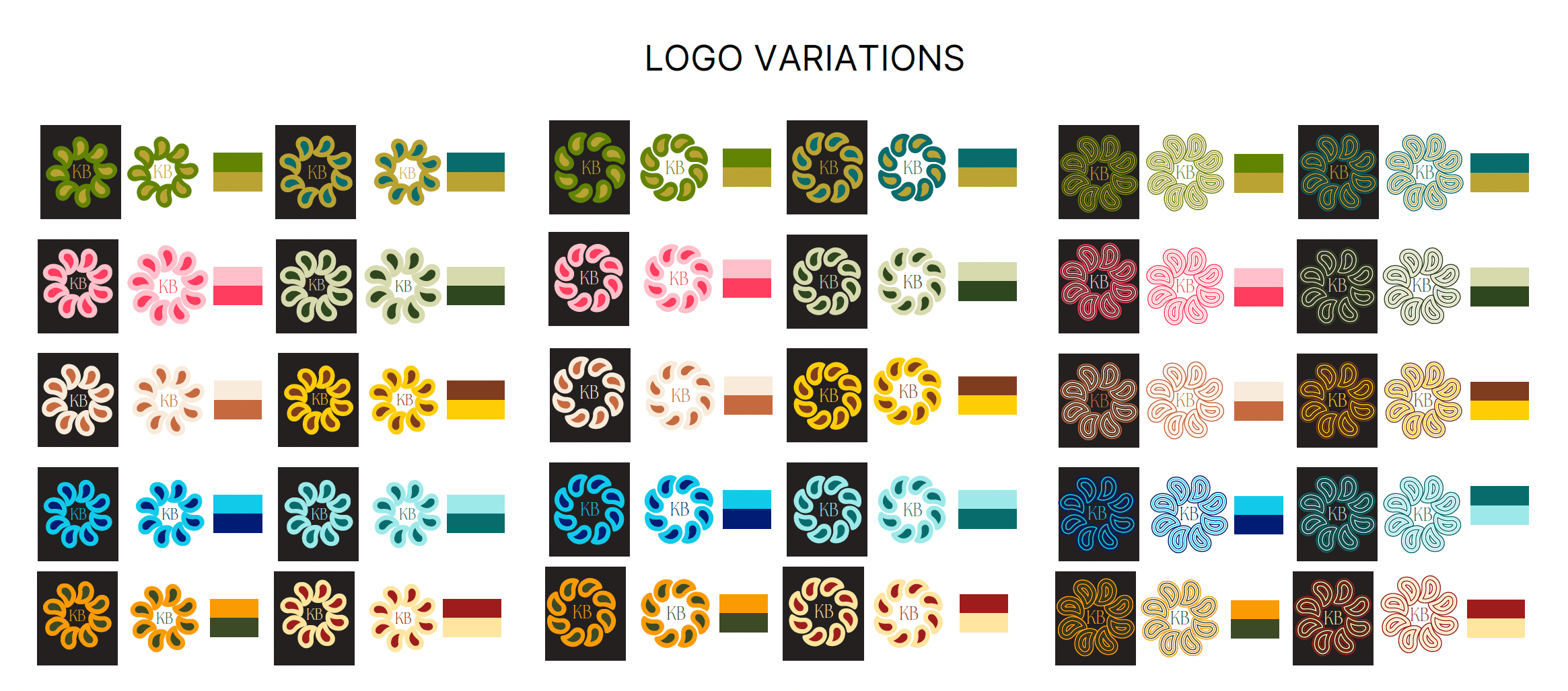
The final identity centers around a minimalist paisley (kairi) motif, an iconic element of Banarasi design. The logo feels refined and versatile, able to scale across touchpoints. The colour palette combines festive yellow, earthy brown, and modern charcoal to convey richness, heritage, and clarity. Typography pairs an elegant serif with clean sans-serif to offer balance and flexibility. The system gives Kairi Banaras a confident, elevated presence, true to its roots yet ready for a modern retail audience.