Fractional - Landing Page for Consulting Firm
intro.
I designed a new landing page for Fractional, a strategic consulting firm, to reflect their high-caliber offerings with a cleaner structure, refined visuals, and clearer messaging. The layout is anchored in credibility-first storytelling. Trust signals, positioning, and service breakdowns are all structured to offer clarity and drive conversion.

challenge.
The older website had a solid content base but lacked visual hierarchy and polish. The above-the-fold section felt generic and failed to communicate what Fractional actually does. Too many ideas competed for attention, and there was no clear visual narrative. The typography and iconography felt inconsistent. Important CTAs were buried. Client archetypes were helpful but looked static and text-heavy. Despite strong testimonials, they lacked modularity and didn’t lead anywhere actionable. The site needed a layout that flowed better, messaging that resonated faster, and visual cues that simplified decision-making.
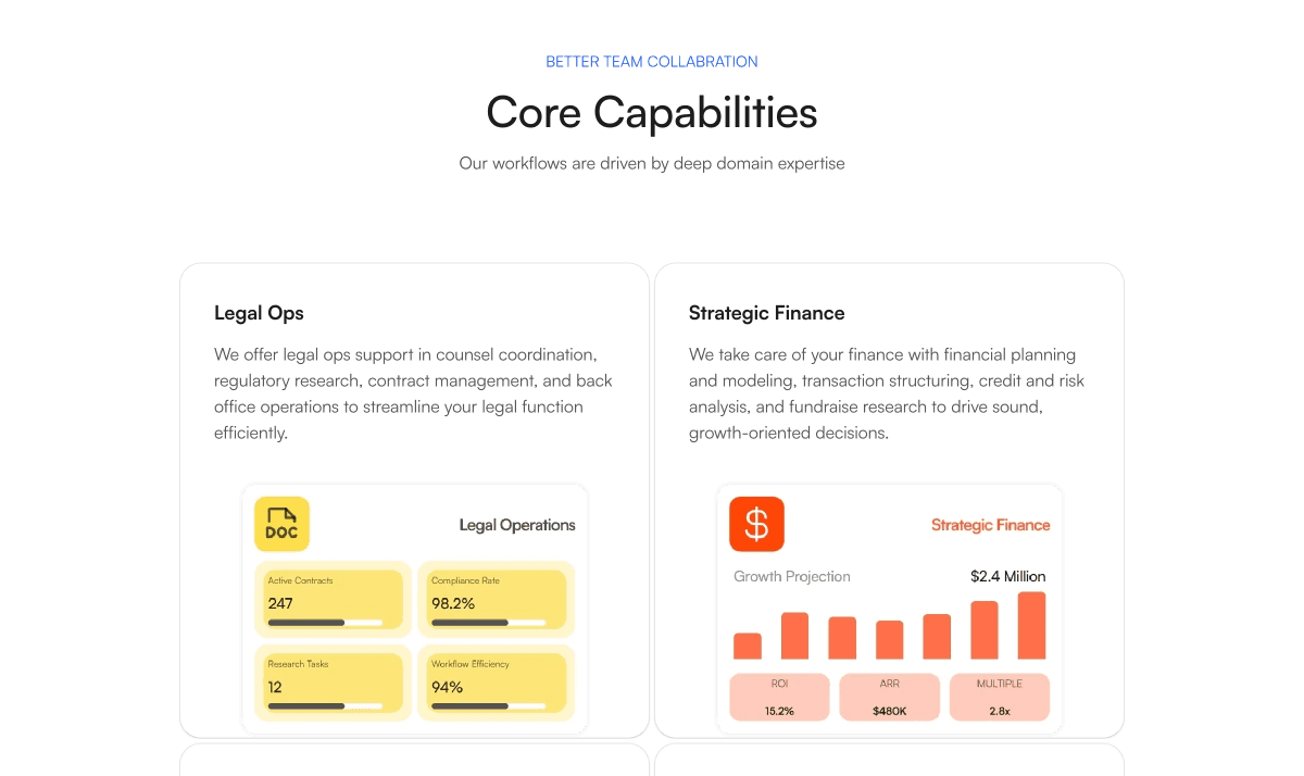
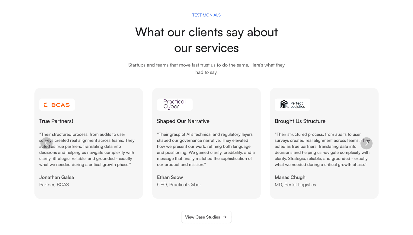
result.
The older website had a solid content base but lacked visual hierarchy and polish. The above-the-fold section felt generic and failed to communicate what Fractional actually does. Too many ideas competed for attention, and there was no clear visual narrative. The typography and iconography felt inconsistent. Important CTAs were buried. Client archetypes were helpful but looked static and text-heavy. Despite strong testimonials, they lacked modularity and didn’t lead anywhere actionable. The site needed a layout that flowed better, messaging that resonated faster, and visual cues that simplified decision-making.